Founder Notes
The Logo That Took More Than Six Rounds to Get Right
22 May 2026 · A founder's search for something that actually meant something
The Logo That Took More Than Six Rounds to Get Right
Before a single line of code. Before the wireframes. Before any of it, I needed to know what LoveHuddle actually stood for. Not in words. In something you could see.
That search started on Pinterest.
I spent time researching hands. What they mean. What they communicate. How they've represented human connection across every culture, every era. Hands hold. Hands reach. Hands bring people together. That felt true to what I was building. So that became the brief.
What followed was one of the most frustrating and rewarding parts of building LoveHuddle.
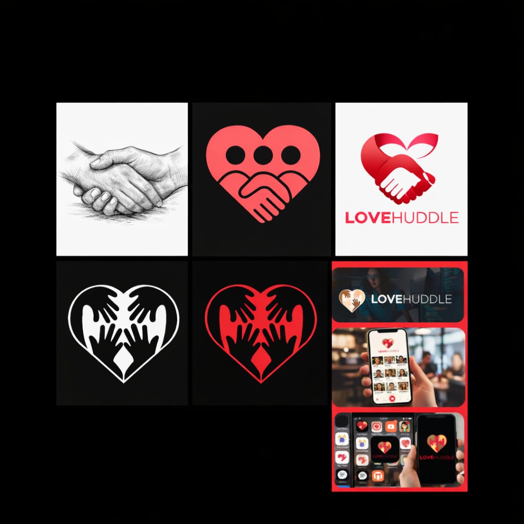
Round 1 — The AI Concept
The first concept came from an AI design tool. Swirling overlapping circles, binary code running through them, a circuit symbol in the wordmark. It looked like a tech startup. Clever, polished, cold. It wasn't LoveHuddle.
Back to the drawing board.
Round 2. Wrong Emotion
This one had the right idea, a handshake inside a heart. But the three dots across the top made it look like a face. A sad face. On a dating platform. Not quite the feeling we were going for.
Round 3: The AI Handshake
A human hand shaking a robotic AI hand, forming a heart. This one was interesting. It told a story about technology meeting humanity. But it put the AI front and centre when the whole point of LoveHuddle is people first. Technology serves the connection, it doesn't lead it.
Round 4. Getting Closer
Four hands inside a heart. Reaching toward each other. Warmer, more human. But something still wasn't right. It felt generic, like it could belong to any brand.
LoveHuddle needed something more specific. More meaningful.
Round 5. Nearly
Working on the third logo, I had hands inside a heart shape, but something wasn't right. The hands were visible, but somehow they also looked like a skeleton. Two things at once, and not in a good way.
I knew the concept was solid. It just needed time. So I sat with it for a week and worked through it until the solution clicked.
Round 6. Finally
Four hands inside a heart. That was it, not because it looked good, though it does. Because it finally said what LoveHuddle is actually built on.
Every race. Every culture. Every background. No one excluded. Four hands, not two, because connection isn't just between two people. It's a community. A place where everyone reaches toward each other with honesty and intention.
That's what the heart represents. Not a symbol placed on top, but the actual result of those hands meeting.
It's Not Just a Logo
It's the promise of LoveHuddle.
A place where everyone is welcome, equal, and safe to connect.
That's what the rounds were for. Every version that didn't work got us closer to the one that did.
Kevin: Founder, LoveHuddle
Kevin: Founder, LoveHuddle